Project Convergence - logo redesign
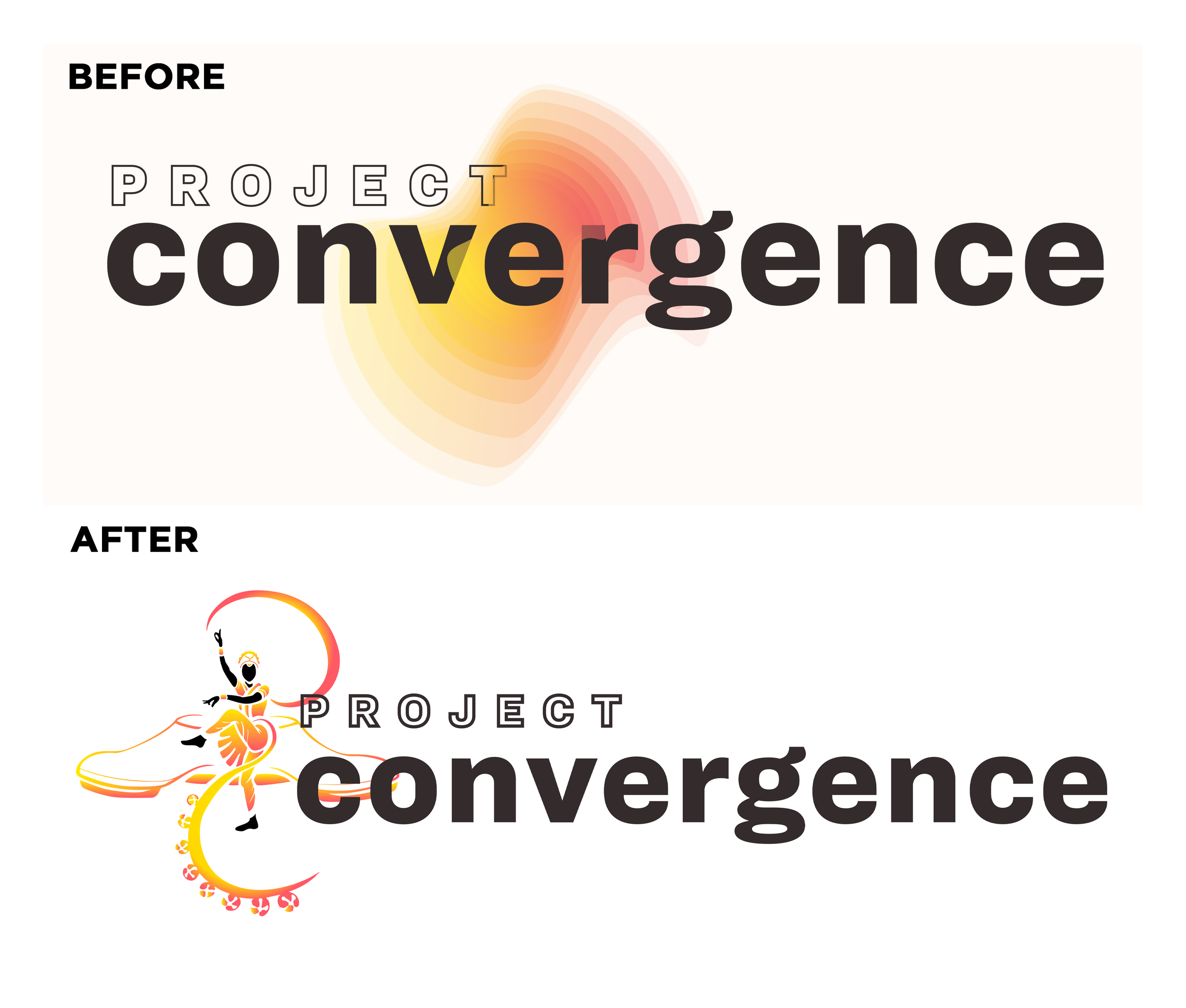
This logo redesign project was focused on developing a more visual representation of the intersection between Bhratanatyam and Tap Dance, incorporating Project Convergence’s existing brand colors and typography to maintain a consistent brand identity while crafting a more dynamic, rhythmic, and illustrative logo. Details include a PC Monogram, bharatanatyam dancer, ghungroo bells, and tap shoes.
Project Convergence is home to the union of Bharatanatyam and American tap dance. Lauded by both the New York Times and The Hindu, Project Convergence presents an experience simultaneously familiar and unfamiliar to audiences by uniting two seemingly different cultures in the universal language of rhythm.
